The Milwaukee Brewers are dipping into their rich history and bringing back a fan-favorite look – powder blue is officially making a permanent return to the team’s uniform lineup.
This isn’t just a nostalgic nod to the past. It’s a full-circle moment for a franchise that wore powder blue with pride from 1970 to 1985, a stretch that included some of the most memorable seasons in club history – MVP campaigns, playoff pushes, and even a World Series appearance. Now, that iconic hue is stepping back into the spotlight, not just as a throwback, but as a staple.
Starting in spring training of 2026, the Brewers will debut this all-blue look on the field. The jersey features “Milwaukee” across the chest in a bold, custom typeface that draws inspiration from the city’s industrial roots – a block, slab-serif font that speaks to the grit and tradition of both the city and the ballclub. It’s a look designed to feel both timeless and modern, bridging the past and present in a way that feels distinctly Milwaukee.
Fans won’t have to wait long to get their hands on it. The new powder-blue jersey hits the Brewers Team Store on December 5.
This isn’t the first time the Brewers have flirted with powder blue in recent years. The color made a comeback in 2023 as part of their City Connect series – a bolder, more experimental take on the uniform landscape.
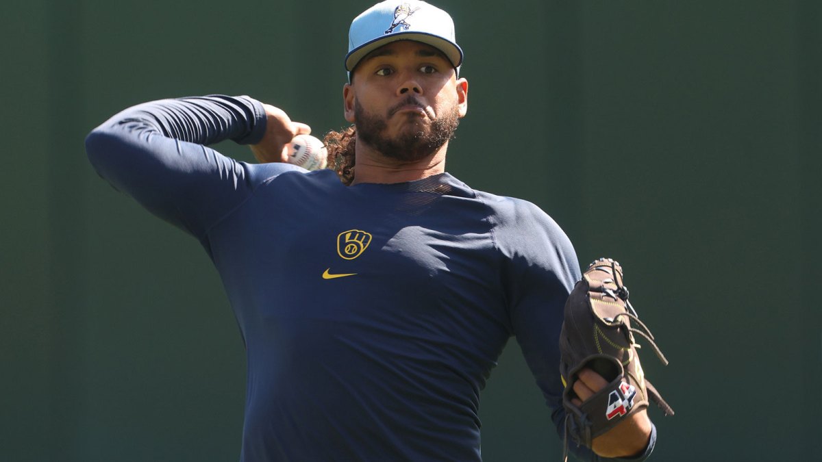
But this new version is meant to stick around. It joins the team’s current rotation of road uniforms – navy blue and gray – and their two home looks: the classic cream and the pinstriped white.
So, what makes this jersey stand out?
Powder-blue base: It’s more than just a color. It’s a symbol of an era – the days of Robin Yount, Paul Molitor, and the 1982 squad that came within a whisker of a championship. It’s a visual cue that instantly transports fans back to a golden age of Brewers baseball.
Brewers yellow accents: A nod to Milwaukee’s brewing heritage, this vibrant yellow was one of the team’s original colors and adds a pop of energy to the design. It’s a color that connects the team to the city’s culture and identity.
Navy blue details: First introduced in 1994, navy has been a constant in the Brewers’ brand ever since. Here, it works as a grounding element – a steady presence that ties this new look to the franchise’s more recent history.
Milwaukee wordmark: Front and center, the city name is proudly displayed across the chest. It’s a reminder that wherever the Brewers go, they’re carrying the spirit of Milwaukee with them.
Custom typeface: The font isn’t just a design choice – it’s a statement. Inspired by the city’s industrial backbone, it reflects strength, resilience, and a deep connection to the community.
As team president Rick Schlesinger put it, this jersey is about more than aesthetics. “We want this jersey to represent the Milwaukee aesthetic – vibrant, historic and full of character, while also serving as a bridge to the past and present eras of Brewers baseball,” he said in the team’s official release.
That’s the heart of this redesign – a connection. Between generations of fans.
Between eras of Brewers teams. Between a city and the ballclub that wears its name.
For a team that’s always embraced its identity – from the Ball-in-Glove logo to the Sausage Race – this new powder-blue uniform is another chapter in a story that keeps evolving while never forgetting where it started.